Comp I
- Not about the Camera
- Comes After Content
- Helps support your content
- Composition is the way that elements are arranged in an image
- Composition includes all the elements of an image, not just the subject
- The rules of composition are not actual rules, they are suggestions or tried and true ways to create harmonious compositions
- It is suggested that the human eye has a tendency to embrace order and rejects chaos
- Complexity does not equal chaos
- Complexity would be the use of multiple rules at one or the breaking of the rules but still in a way that works
How do we Compose:
|
Poorly Composed
Well Composed
Poorly Composed
Well Composed

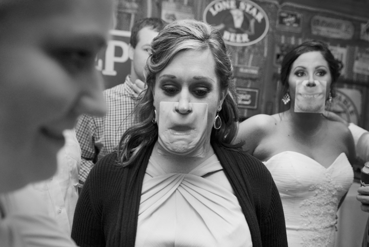
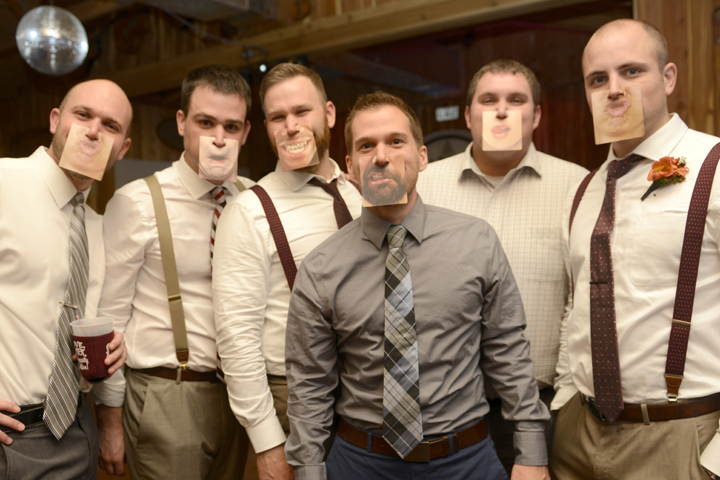
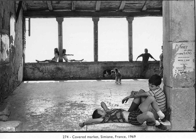
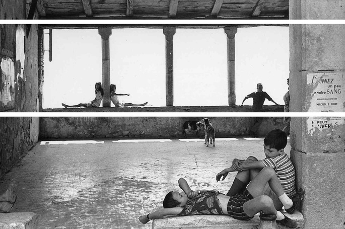
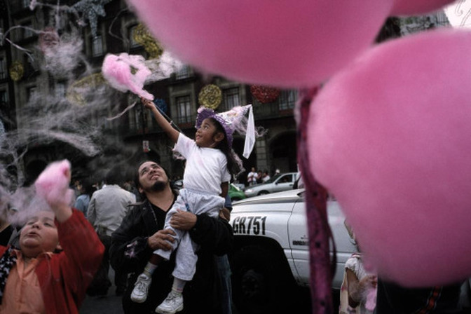
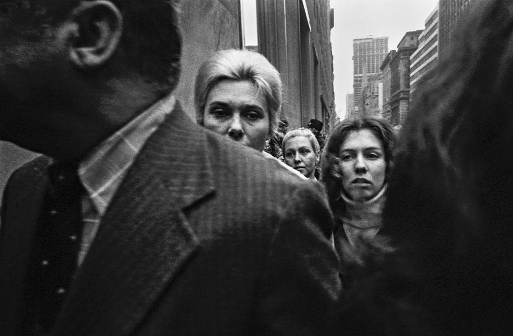
class i - looking in the streets
5 rULES:
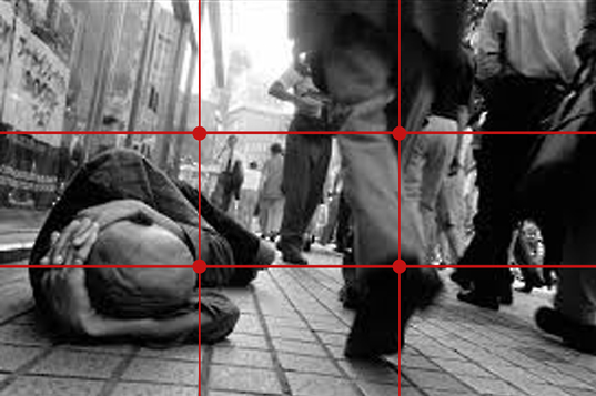
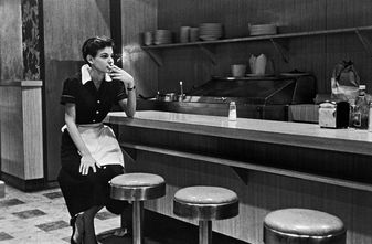
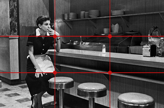
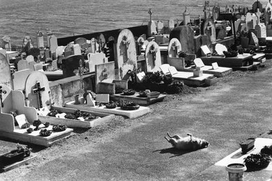
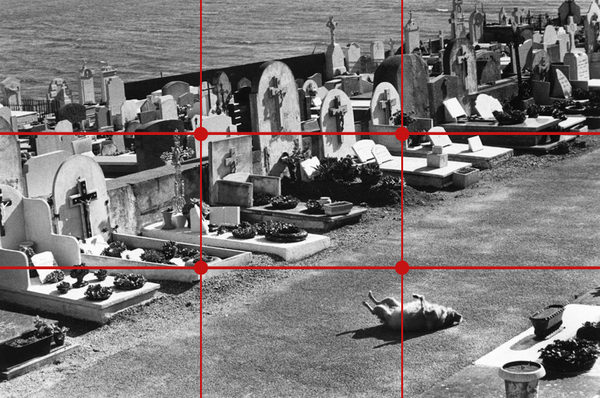
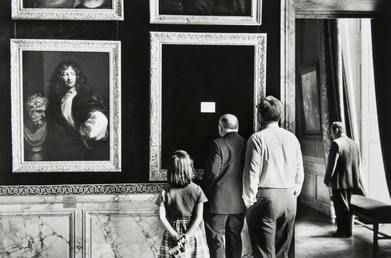
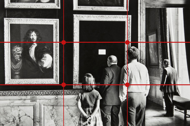
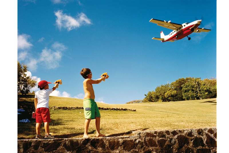
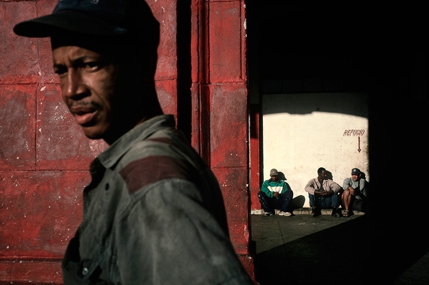
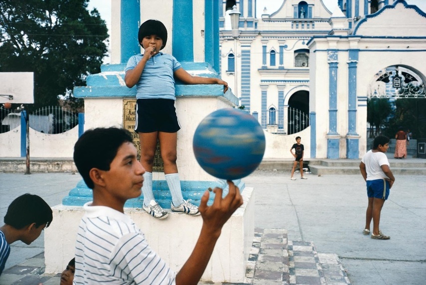
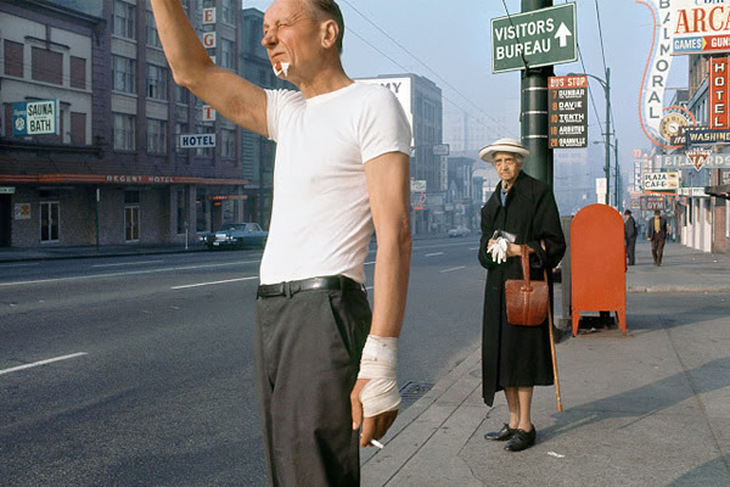
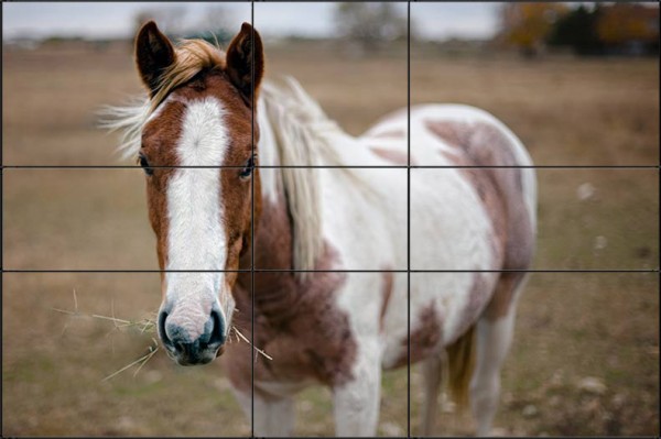
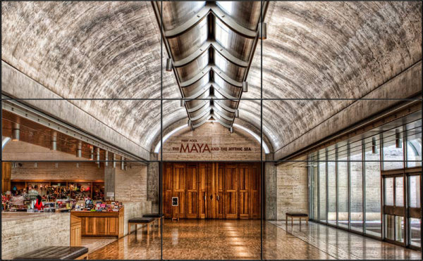
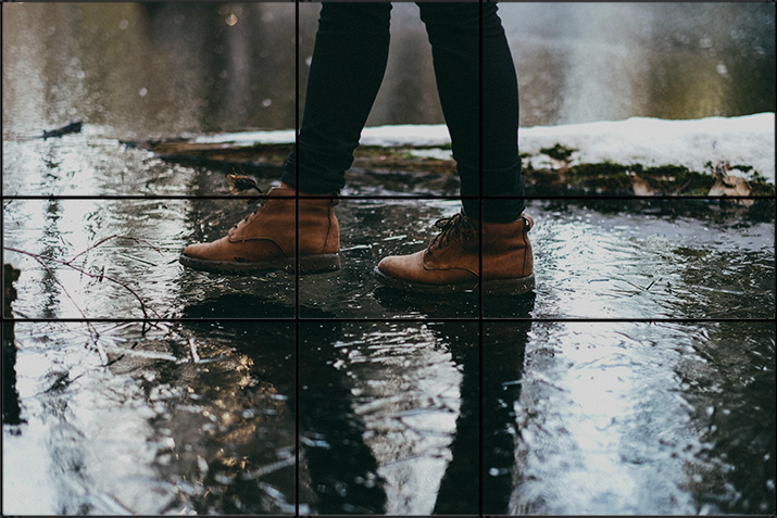
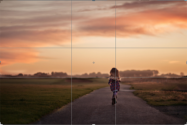
1. Rule of Thirds
- Most widely known and perhaps overused rule
- Avoid the Middle
- Splitting the images into thirds both horizontally and vertically
- place subject on the imaginary line or intersection
- Rule of thirds offers a sense of balance without it looking too intentionally balanced (not that an intentionally balanced images it bad)
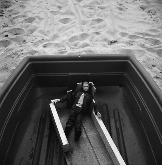
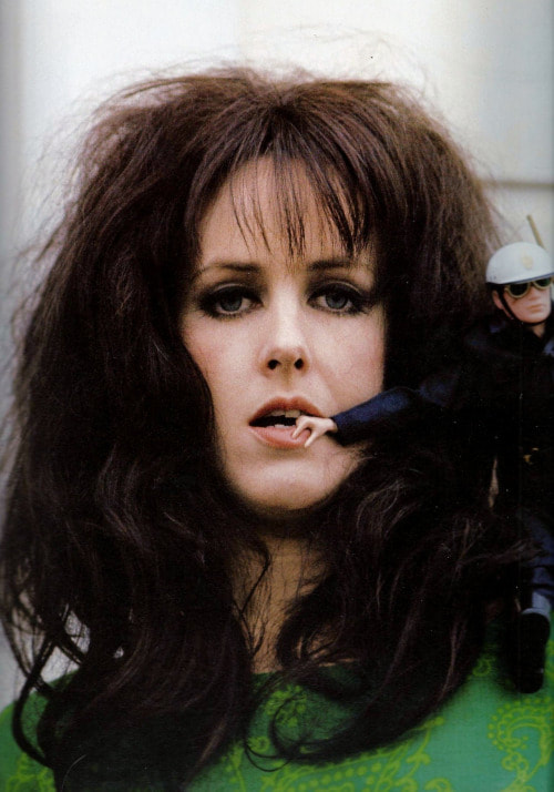
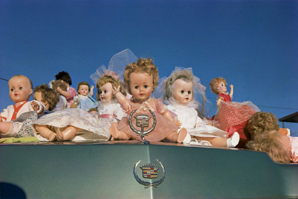
Elliot Erwitt
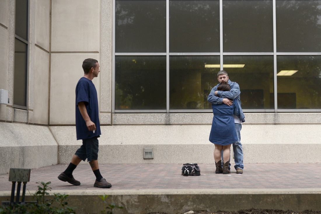
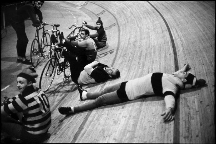
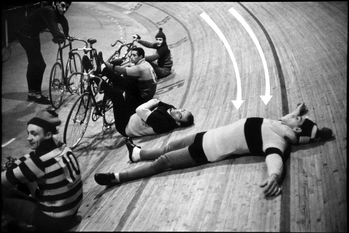
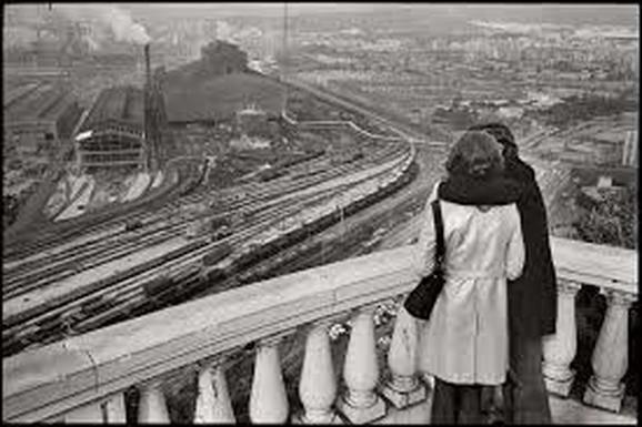
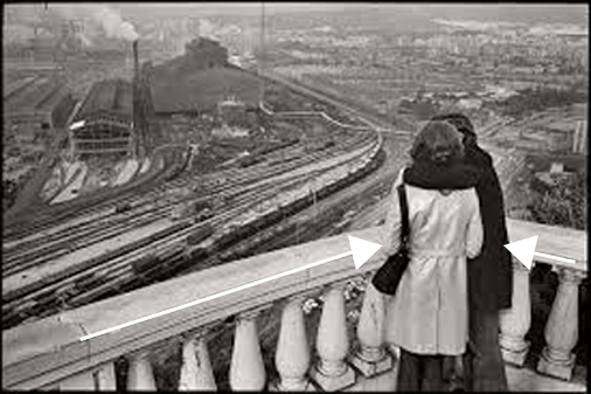
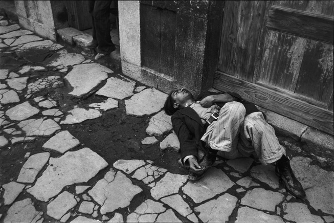
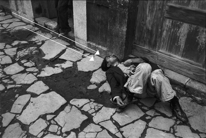
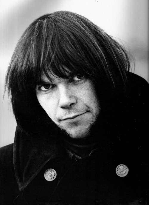
2. Leading Lines
- Lines direct your viewer so they aren't visually wondering around aimlessly (not that I'm opposed to that)
- converging lines give a strong sense of perspective and three dimensional depth
- emphasizes movement
- draws you in
- curved lines can lead you around to the main subject\
- horizontal lines are calming, gives a sense of organization
- vertical lines feel strong and stable
- diagonals feel dramatic, uncertain, unstable
- Wider angle lenses can offer a distortion to lines, creating diagonals and can be very dynamic.
- DUTCH ANGLE: A Dutch angle is a camera shot in which the camera has been rotated relative to the horizon or vertical lines in the shot. The primary use of such angles is to cause a sense of unease or disorientation for the viewer
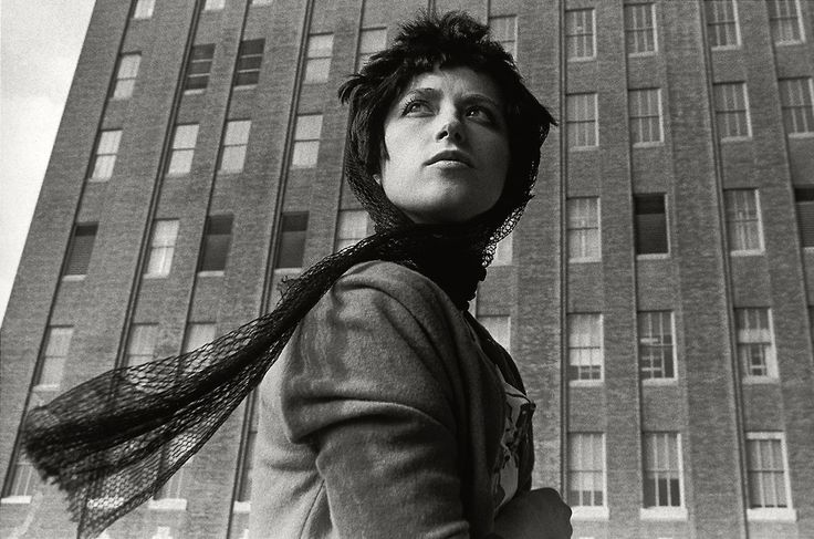
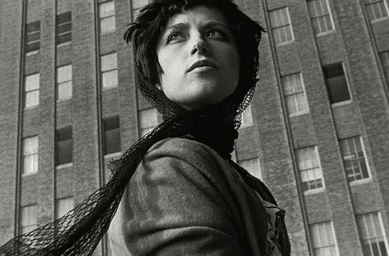
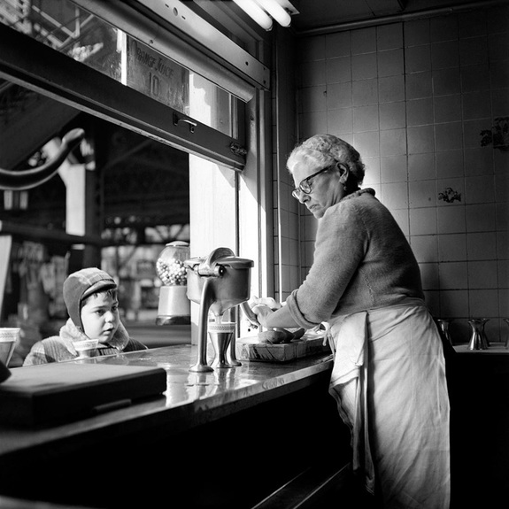
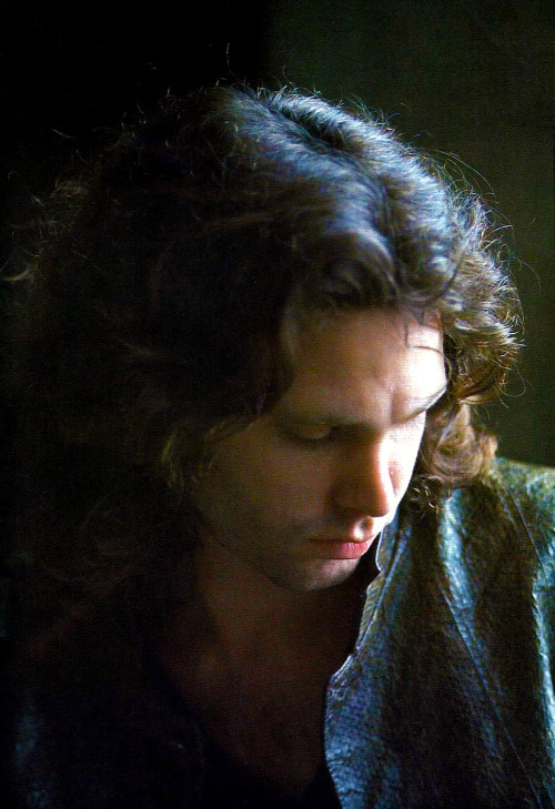
Cartier Bresson

|
Dutch Angle
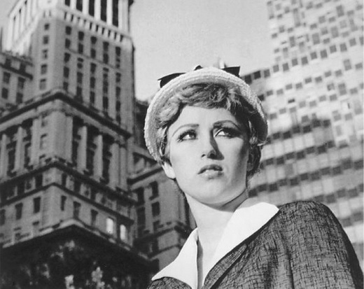
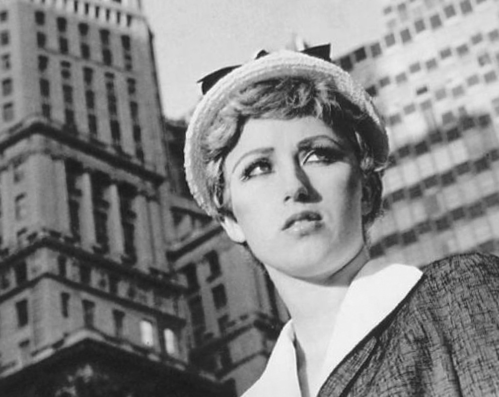
Cindy Sherman
|
|
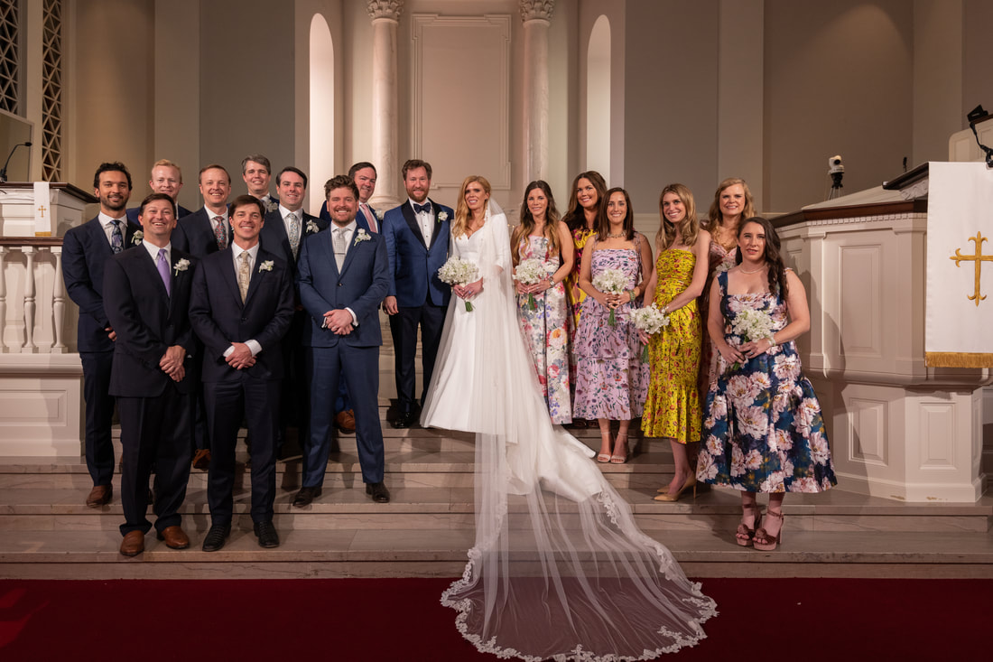
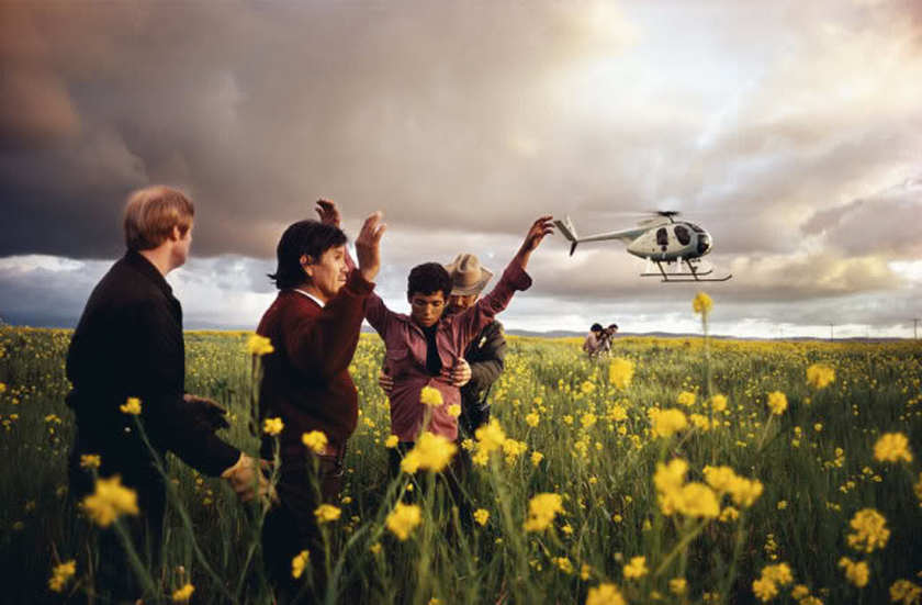
3. Balancing Elements
- balancing weights
- each elements carries a weight
- formal balance is a symmetrical balance. When two similar objects are lined up and the weight is obviously balances
- informal balancing is an asymmetrical balance. When dissimilar objects are balancing on each side of a point
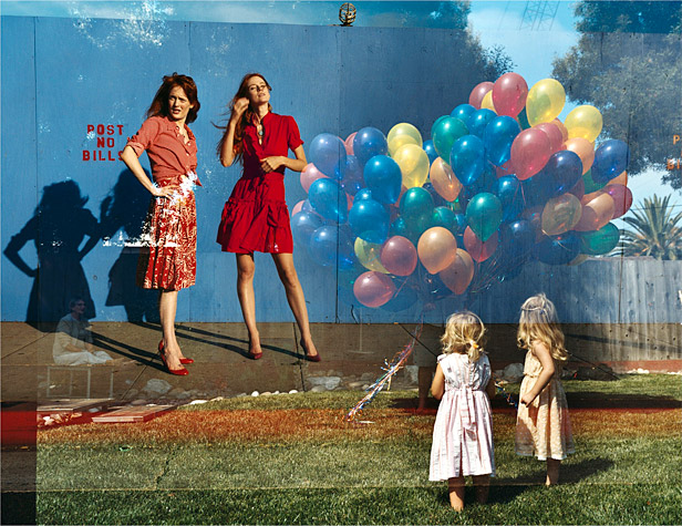
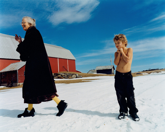
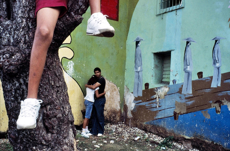
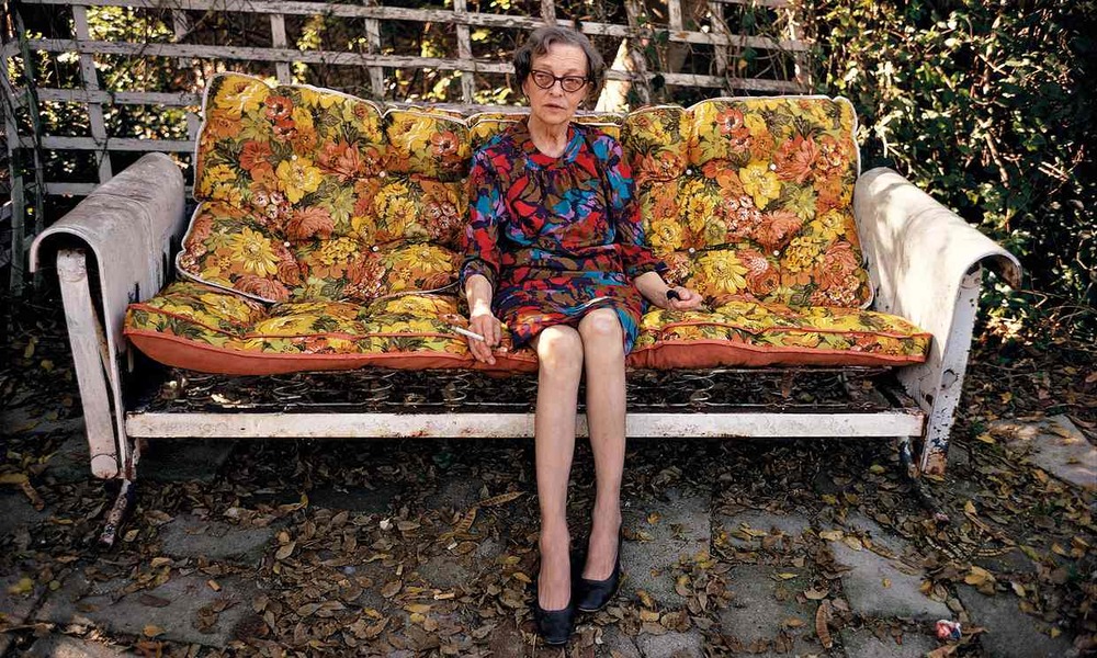
Tierney Gearon
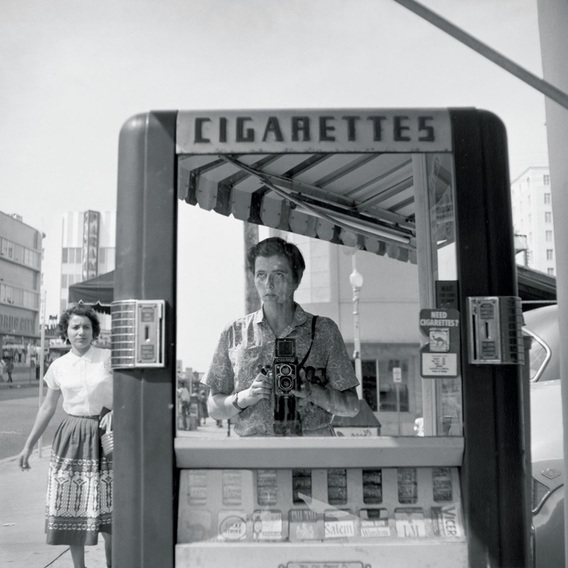
4. Framing
- blocking the subject in
- it can offer context, example is it's foliage from trees, overhanging branches, through a window, a tunnel, arches, a door, or the shoulders and profiles of other people who are surrounding your subject
- offers depth and multiple dimensions
- leads the eye into the subject
- it does not need to go completely around all edges like a traditional frame
- frame inside of a frame
Vivian Maier
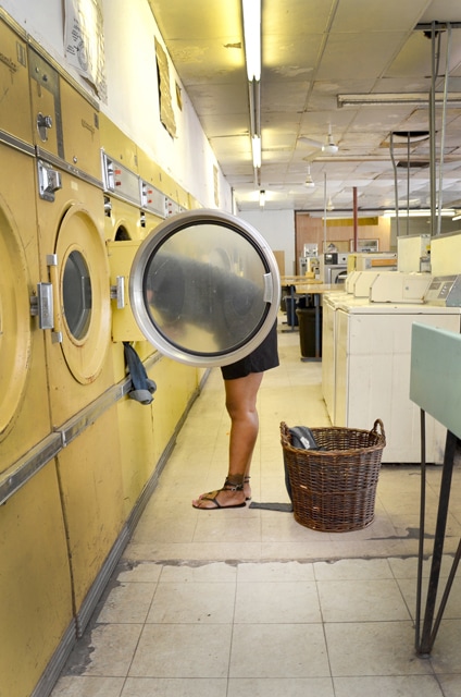
5. Depth
- Can be considered a more advanced composition technique
- Two definitions of depth 1.) measurements from front to back 2.) Complexity and profundity of thought
- Depth like all other composition techniques should support the images content
- conveying depth gives the photo dimensions, foreground and background, and keeps it from appearing flat (not that there is anything wrong with a photo being flat)
- depth can be achieved by overlapping objects and obscuring that objects in the foreground
- Best illustrated when your subjects are not on the same focal plane
- Having elements in the foreground and background
- Shooting with a wide aperture and creating a shallow depth of field with multiple elements in the scene
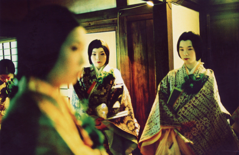
Alex Webb
Class II
|
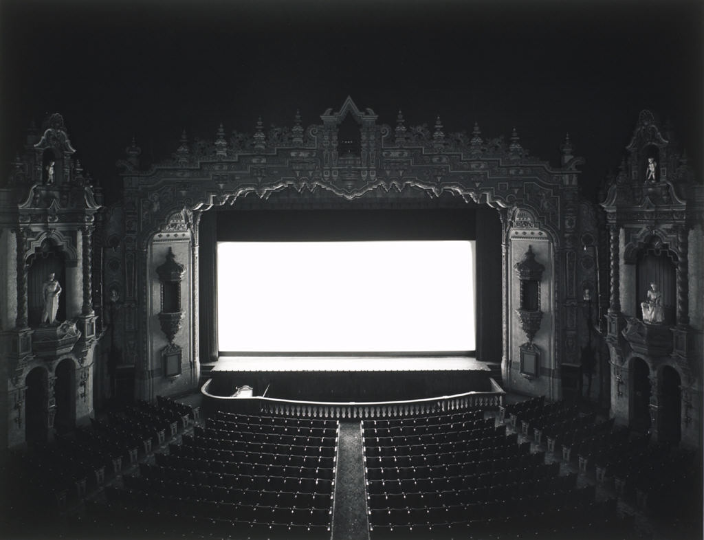
6. Symmetry/Patterns - in architecture
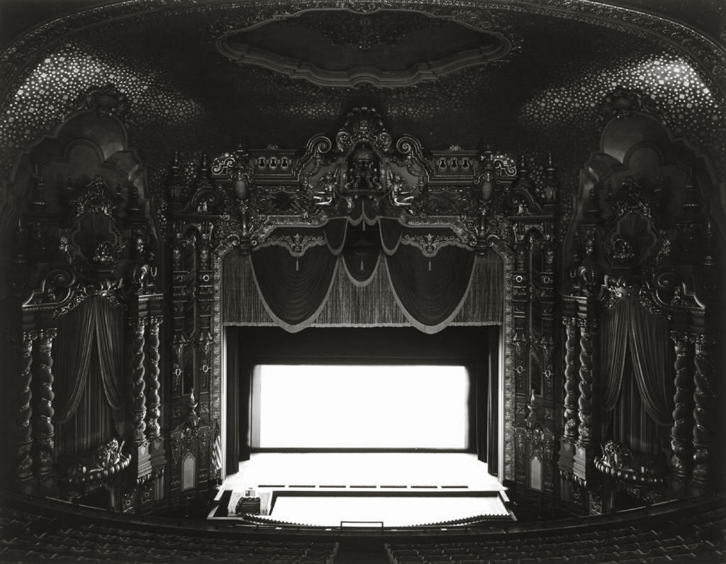
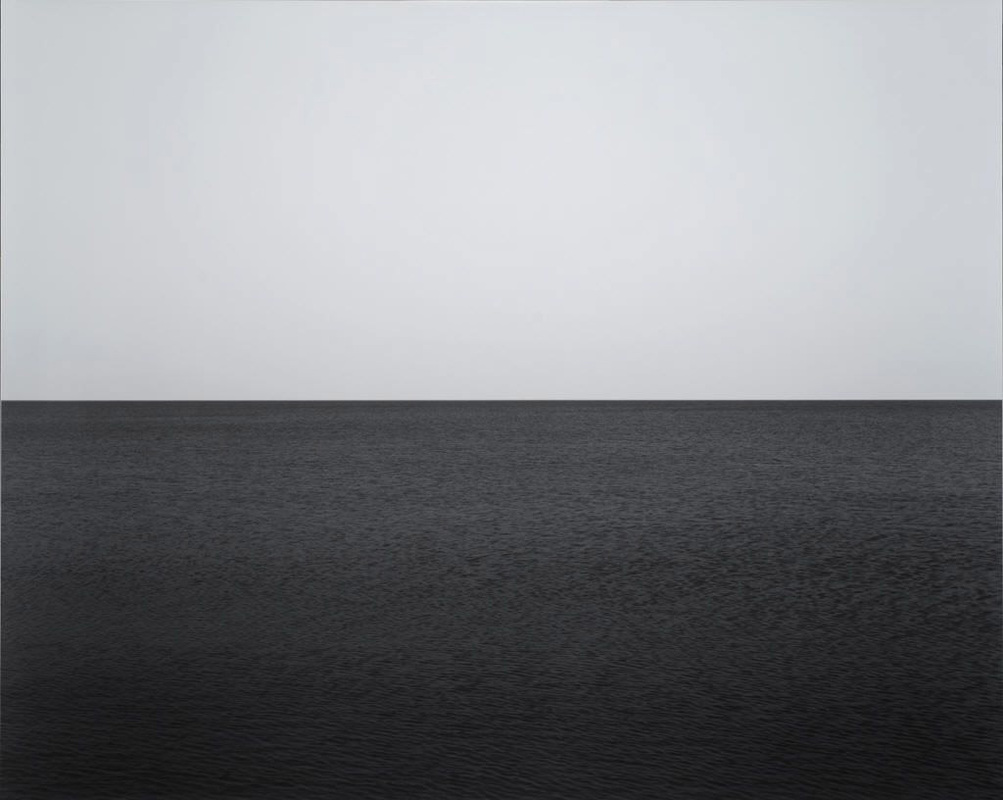
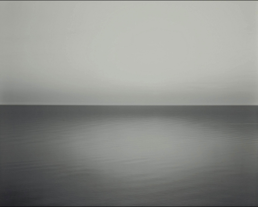
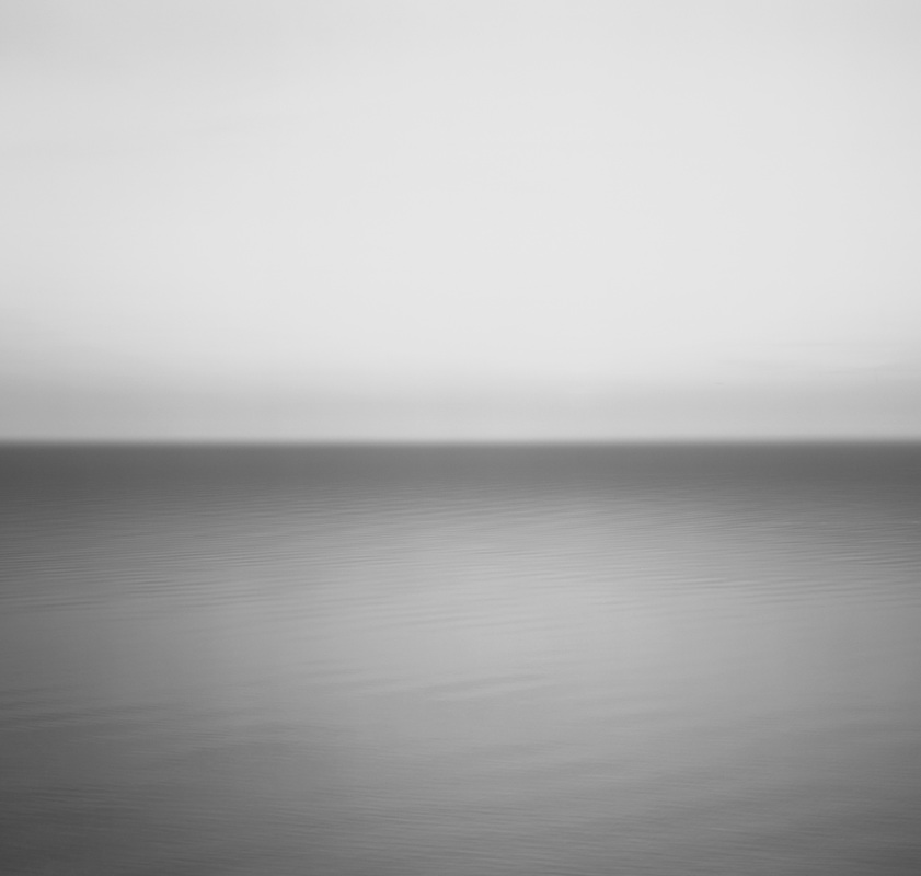
Hiroshi Sugimoto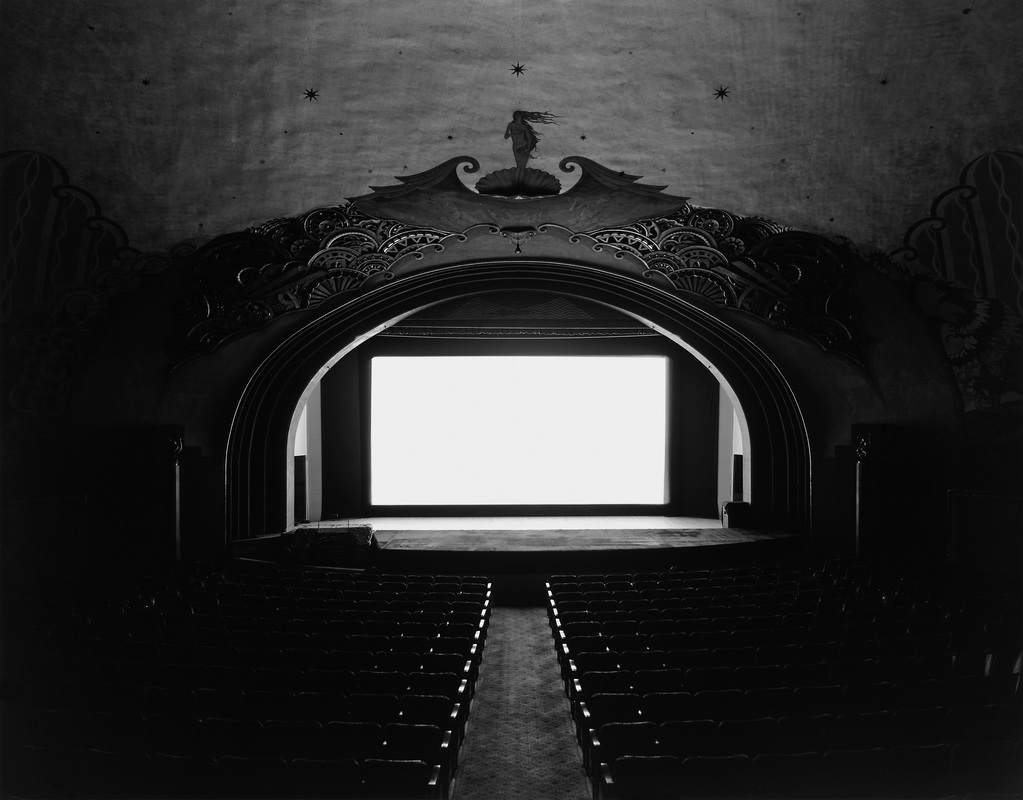
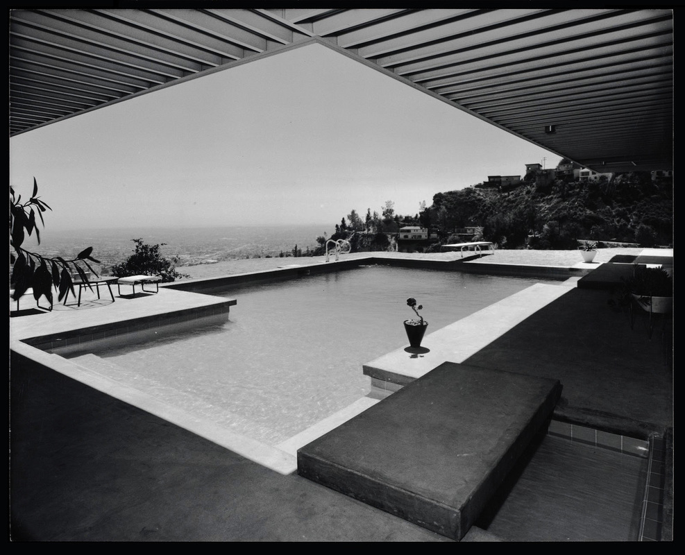
Julius Shulman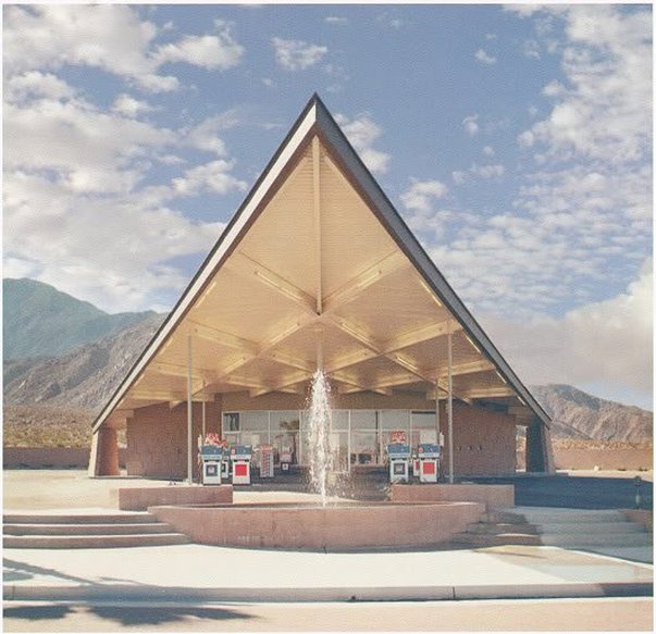
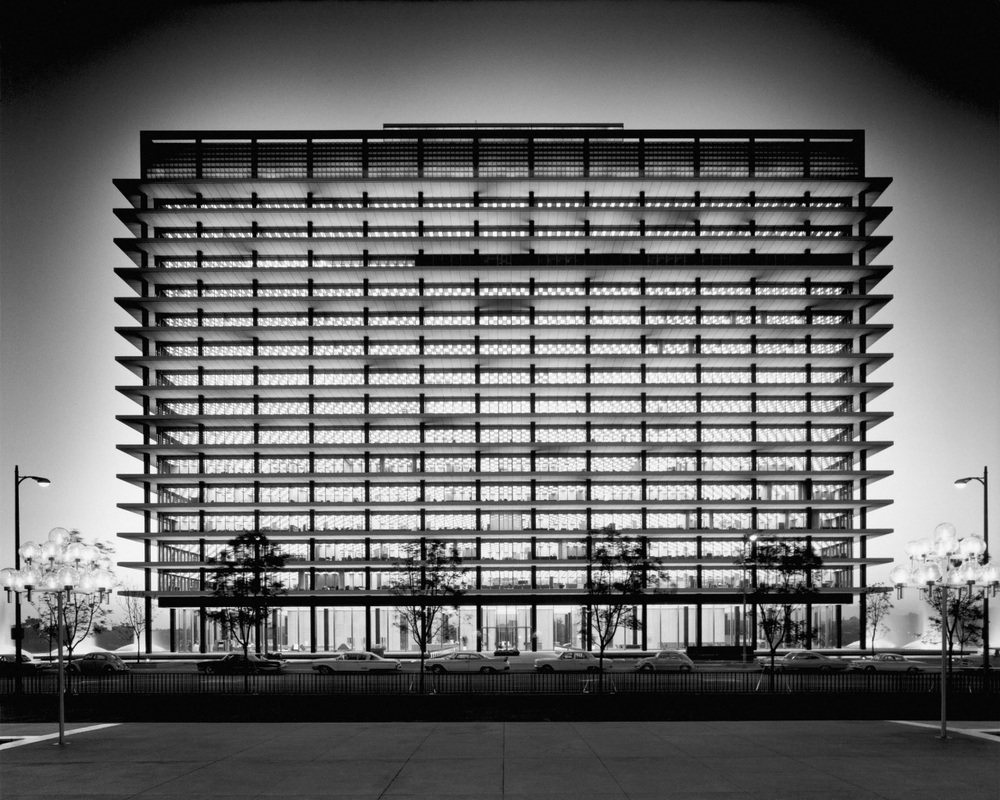
Nadav Kander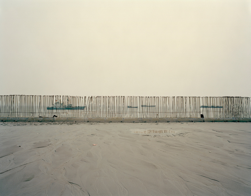
7. Interrupting Patterns
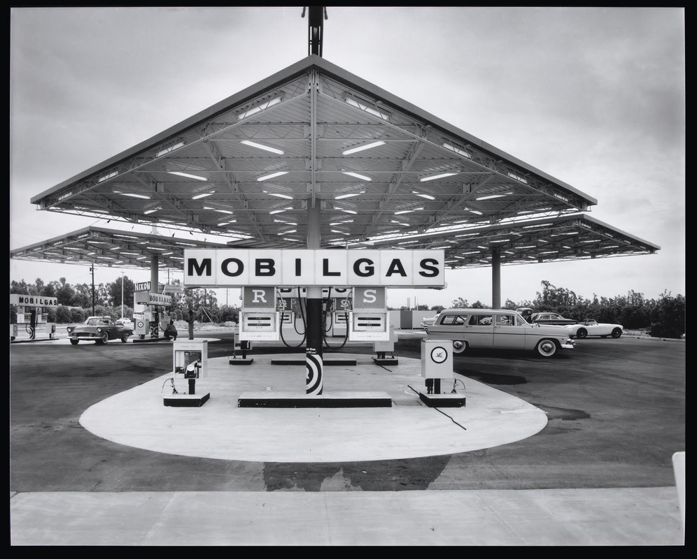
Julius Shulman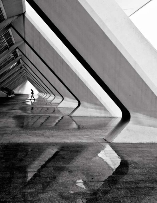
The Abstract ImageHiroshi Sugimoto
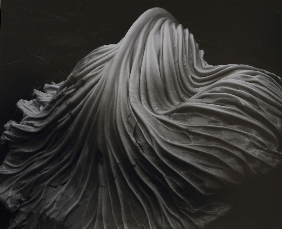
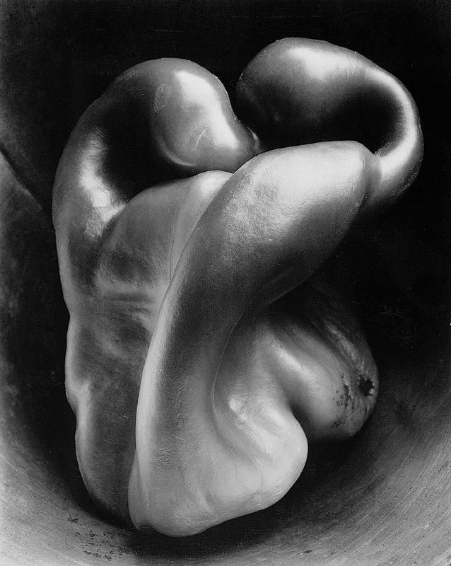
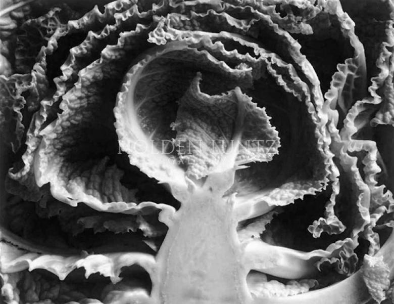
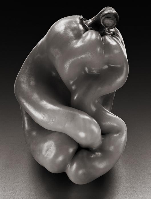
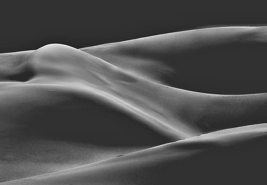
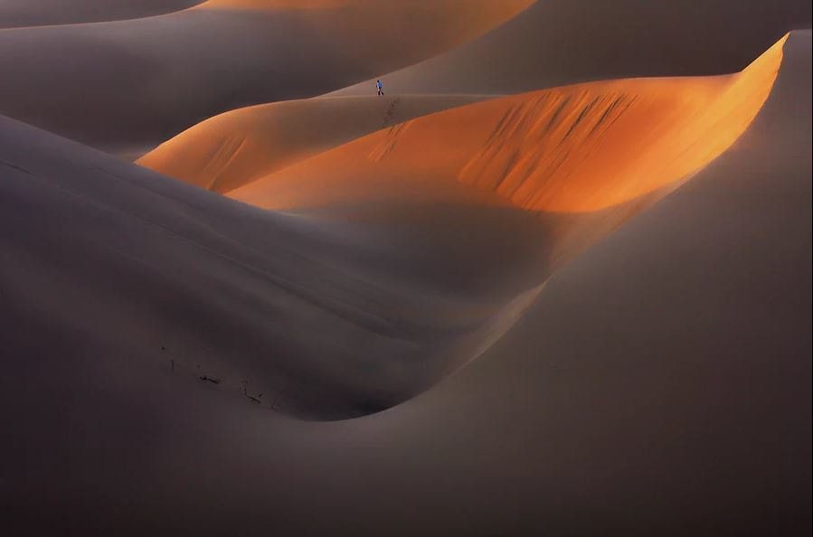
9. Simplicity and the abstract image
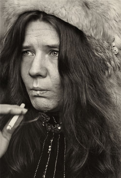
Edward Weston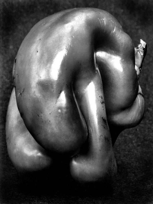
desert ebrahim bakhtari bonab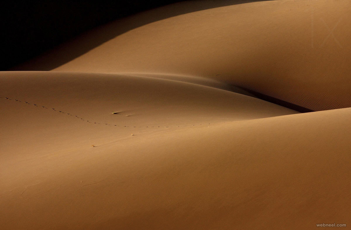
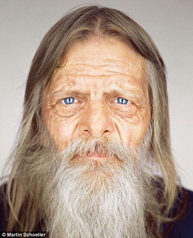
Continuing With SimplictyTexture
Martin Schoeller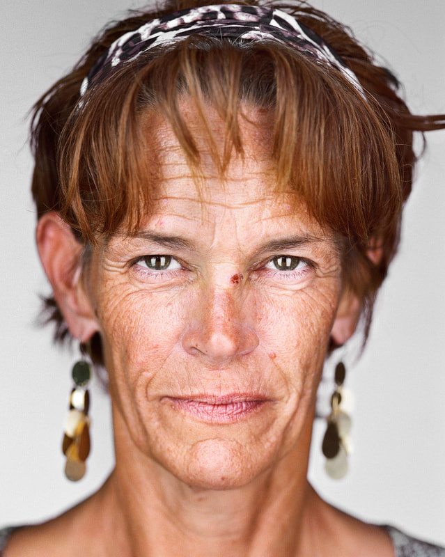
10. Filling the Frame
Linda McCartney
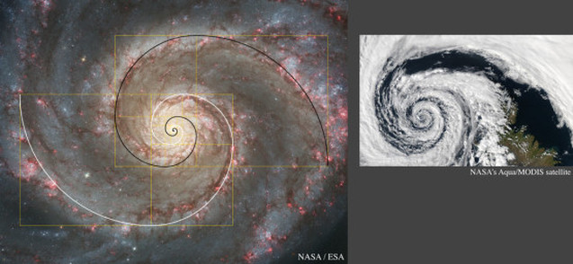
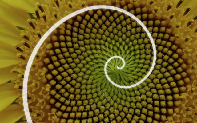
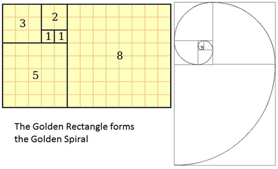
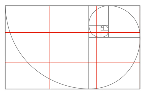
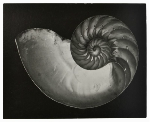
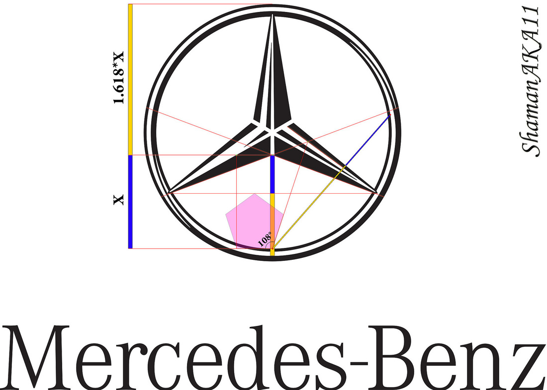
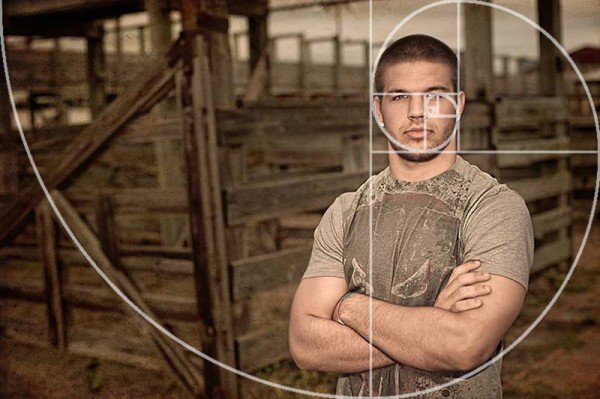
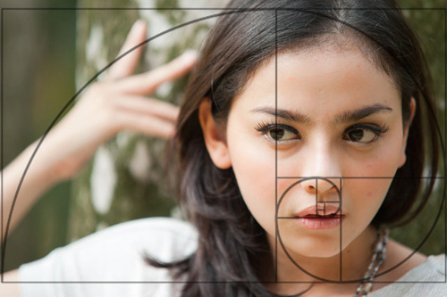
Golden Triangles
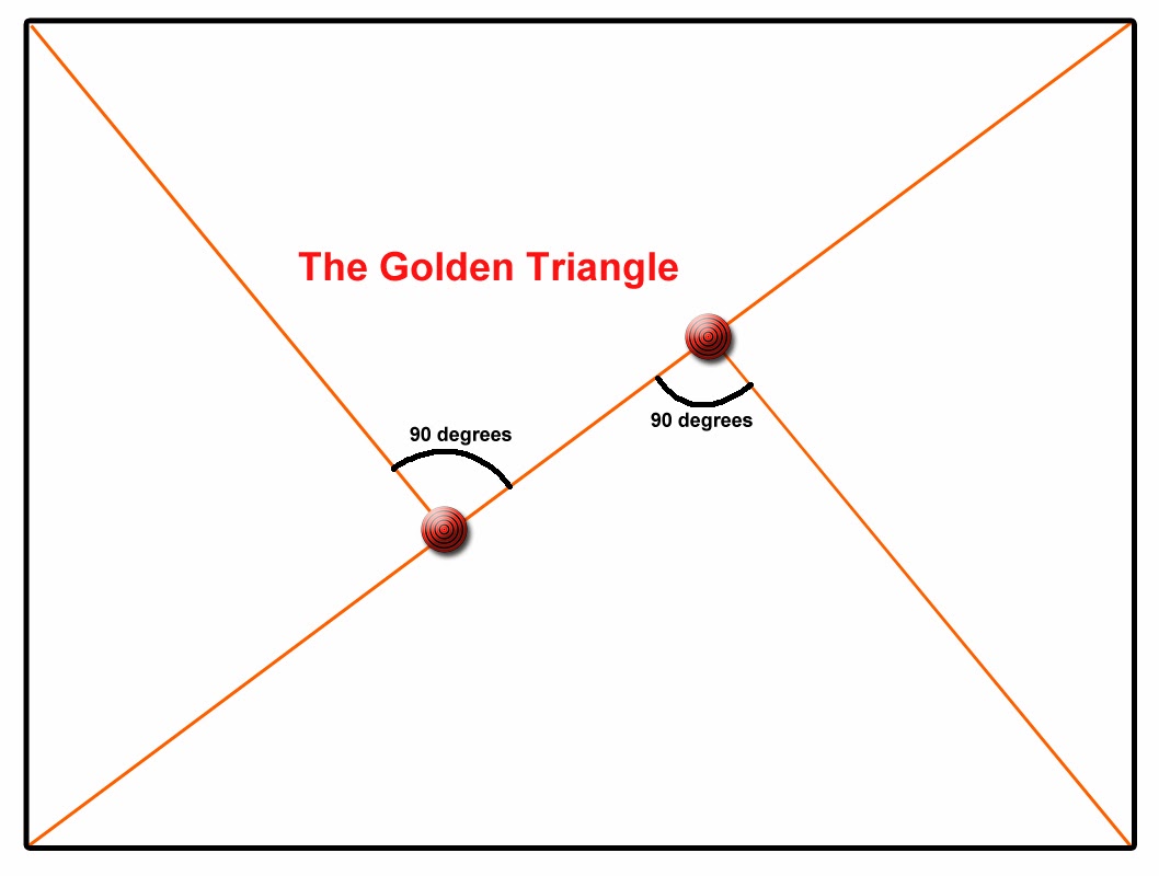
Harvey Stein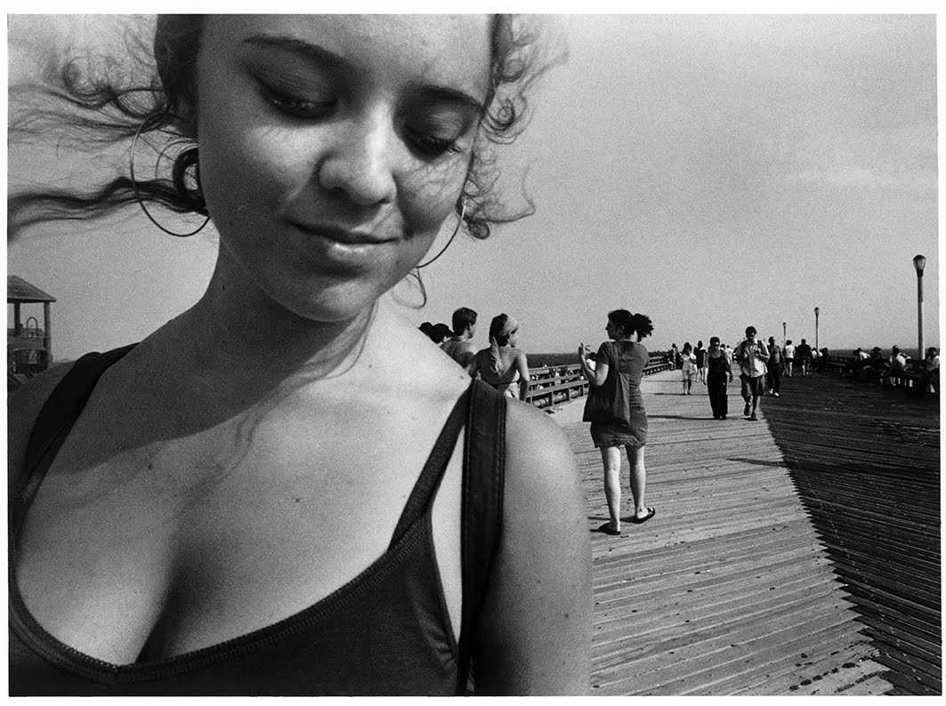
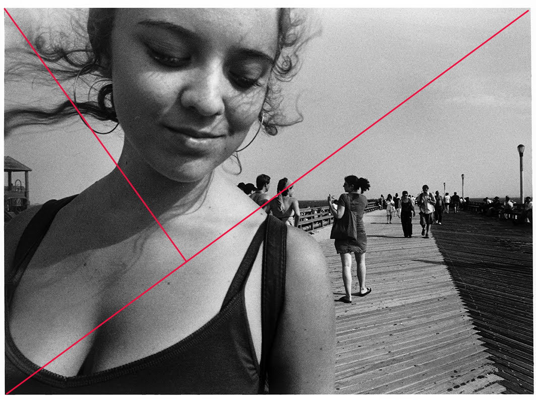
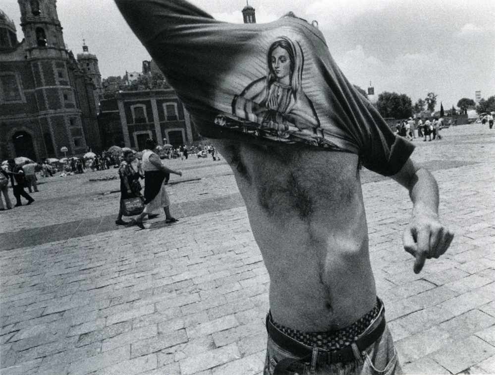
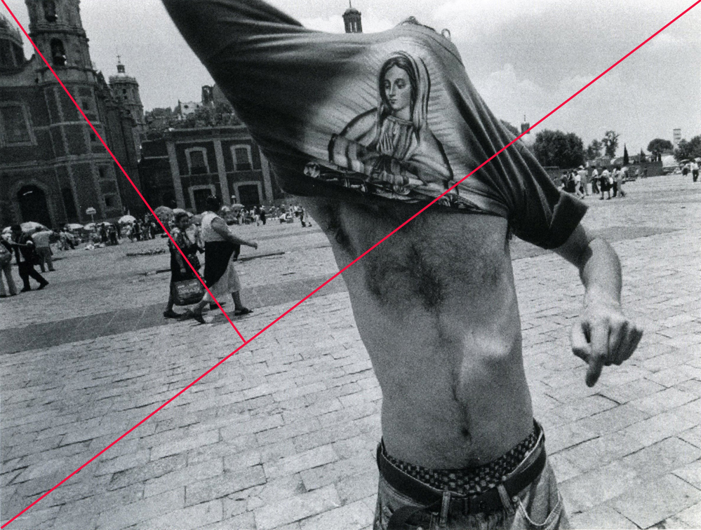
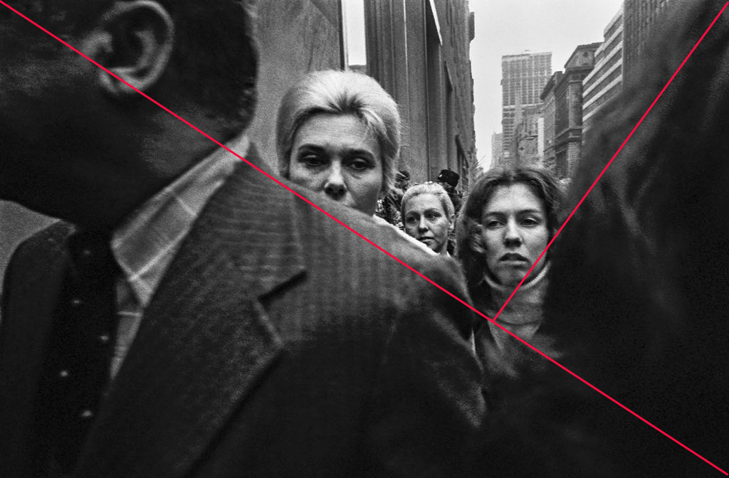
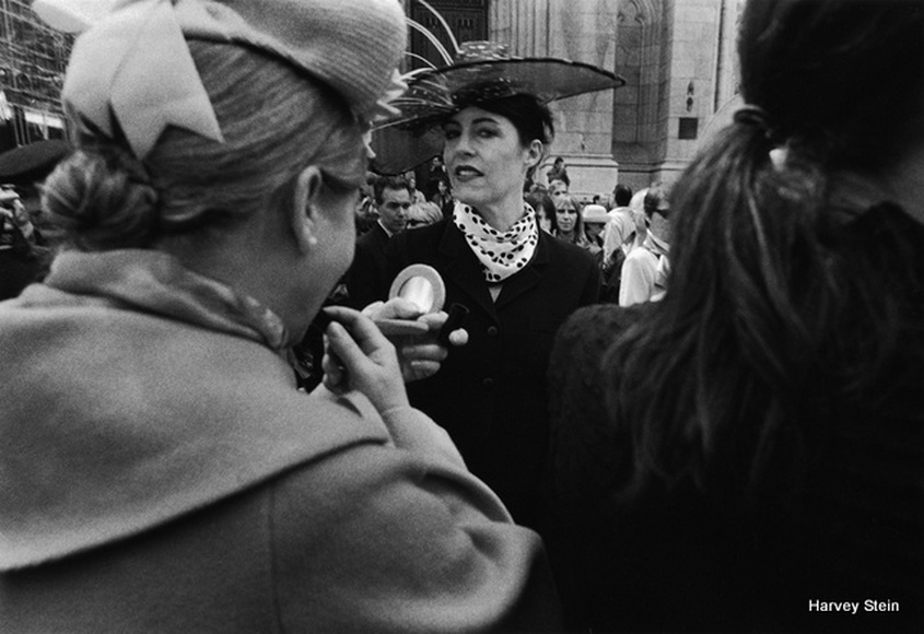
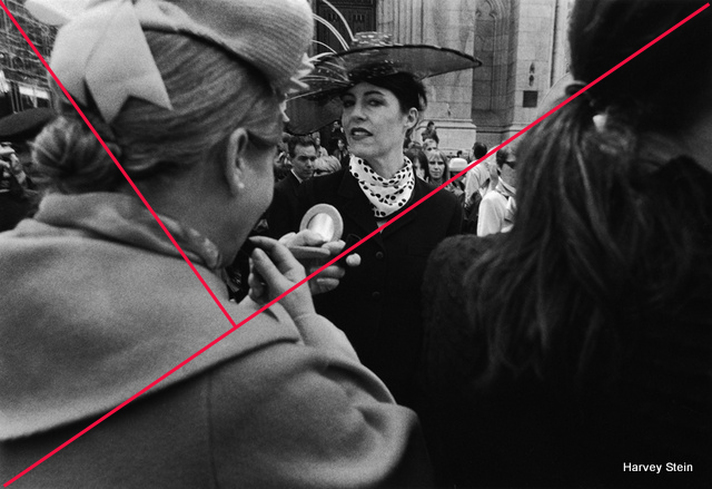
The Golden Ratio - properly allocated space
|


|
|
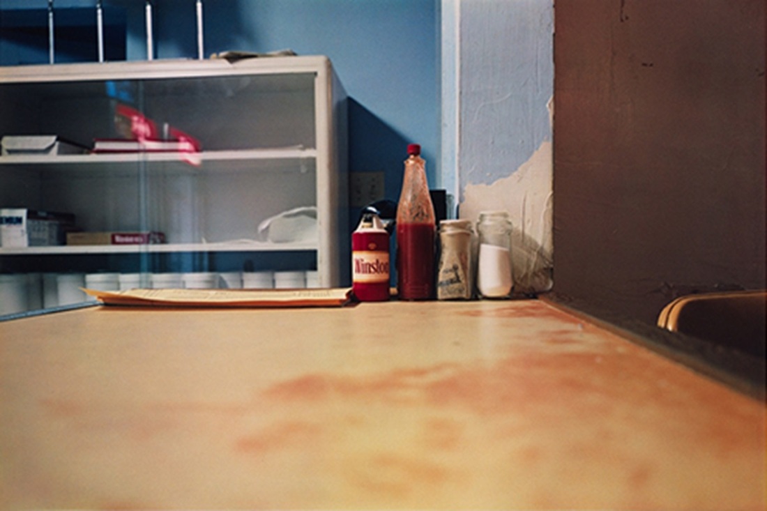
Background
- Background is incredibly important and when I see it neglected in photograph it really bothers me
- Everything that is behind and surrounding your subject is important
- Make sure to eliminate clutter and unintentional distractions such as power lines, parked cars, a McDonald's cup, whatever it is that detracts and does not add
- It's tragic when a person has a pole sticking out of their head or a tree limb coming out of their shoulder
- a good way to deal with a messy background is to put it way out of focus using a shallow depth of field
- If it's going to be sharp it needs to be attractive and/or cohesive
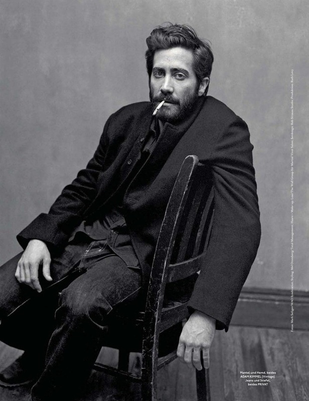
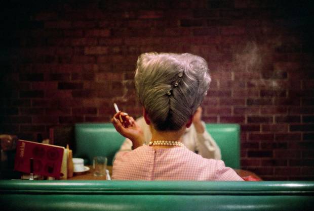
Mark Seliger (enjoyed a brick wall)
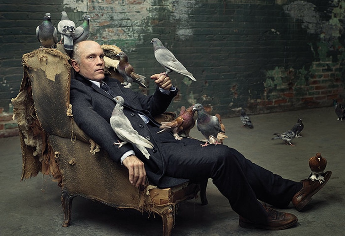
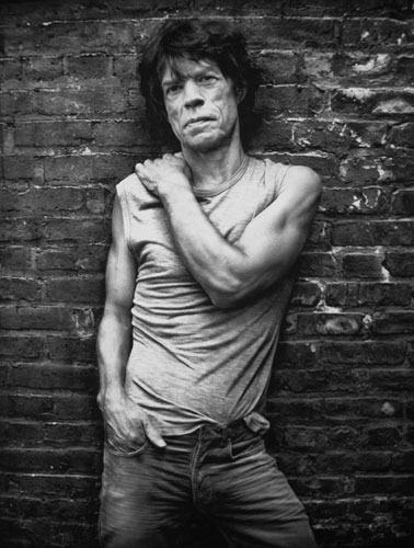
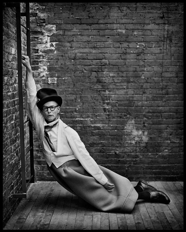
He eventually evolved to a grey painted wall
Orientation
- Landscape (horizontal) or Portrait (vertical)
- The names imply that some subjects are better suited to one orientations than another (but this isn't really true)
- I think photographers after awhile tend to one orientation over the other no matter what they are shooting ( I prefer shooting horizontally but I'm not totally held to it)
- I recommend shooting all photos in both orientations
- If it's a collection of photos you are creating I recommend all images in the collection adhere to the same orientation (although it's not a rule, it just looks better on the wall)
- You can always crop images to have a square orientation
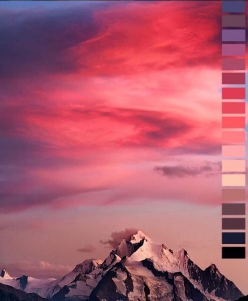
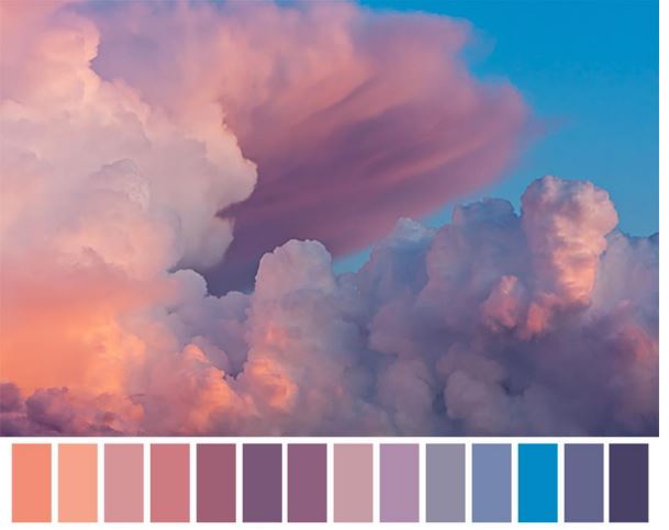
Photography and Color - light sources give different colors
Kelvin Scale and white balance:
Different Light sources give off different colors, we talk about them in terms of temperature. This comes from the Kelvin Scale. The color the light source the warmer the color it projects. For example a candle does not burn very hot, thus the color it puts on the photos is very warm or yellow orange, the sun burns extremely hot thus throwing blue on the image. In the camera, your white balance, which is based on the kelvin scale aims to correct these color saturation. We call it white balance because it aims to make the whites look white and for colors to appear true to life.
KELVIN:
1000-2000 K Candlelight
2500-3500 K Tungsten Bulb (household variety)
3000-4000 K Sunrise/Sunset (clear sky)
4000-5000 K Fluorescent Lamps
5000-5500 K Electronic Flash
5000-6500 K Daylight with Clear Sky (sun overhead)
6500-8000 K Moderately Overcast Sky
9000-10000 K Shade or Heavily Overcast Sky
- Using color deliberately in photography. When we are shooting improvisational, candidly we don't always give a deliberate consideration to the colors that are occurring in our scene, being conscious of the colors in the image can produce more interesting images.
- Using Color deliberately in photography requires a change in how you see things. To start looking at the world in terms of colors is a pratice.
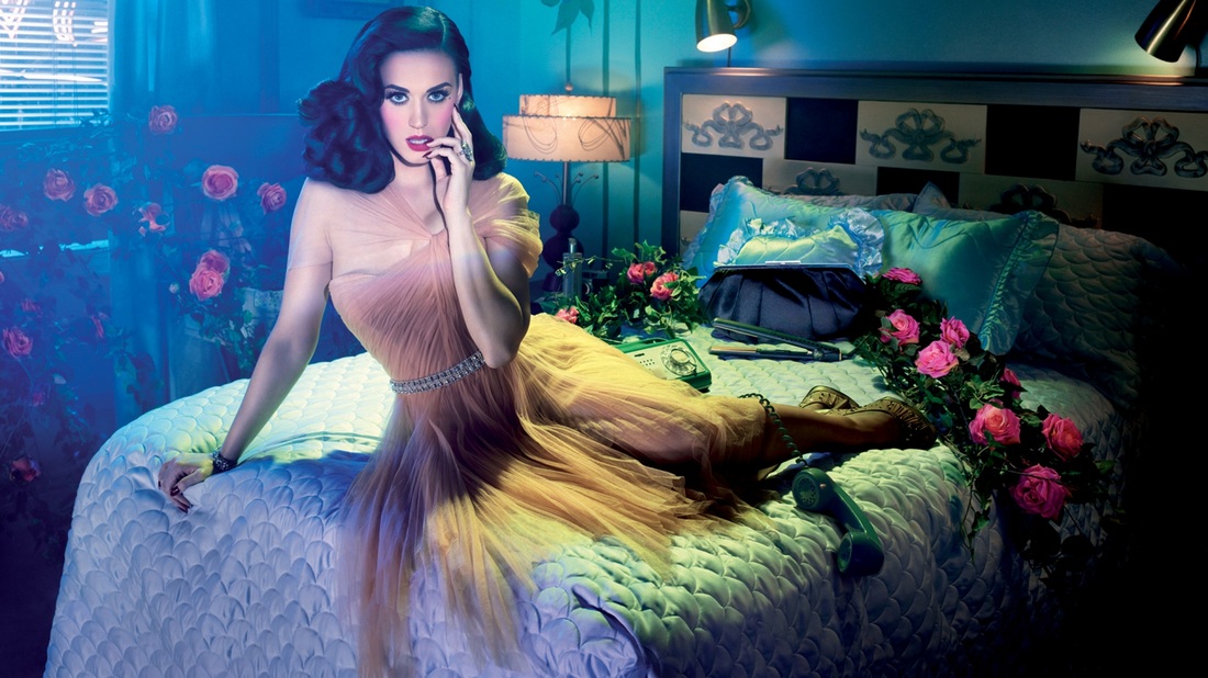
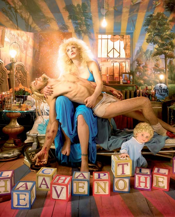
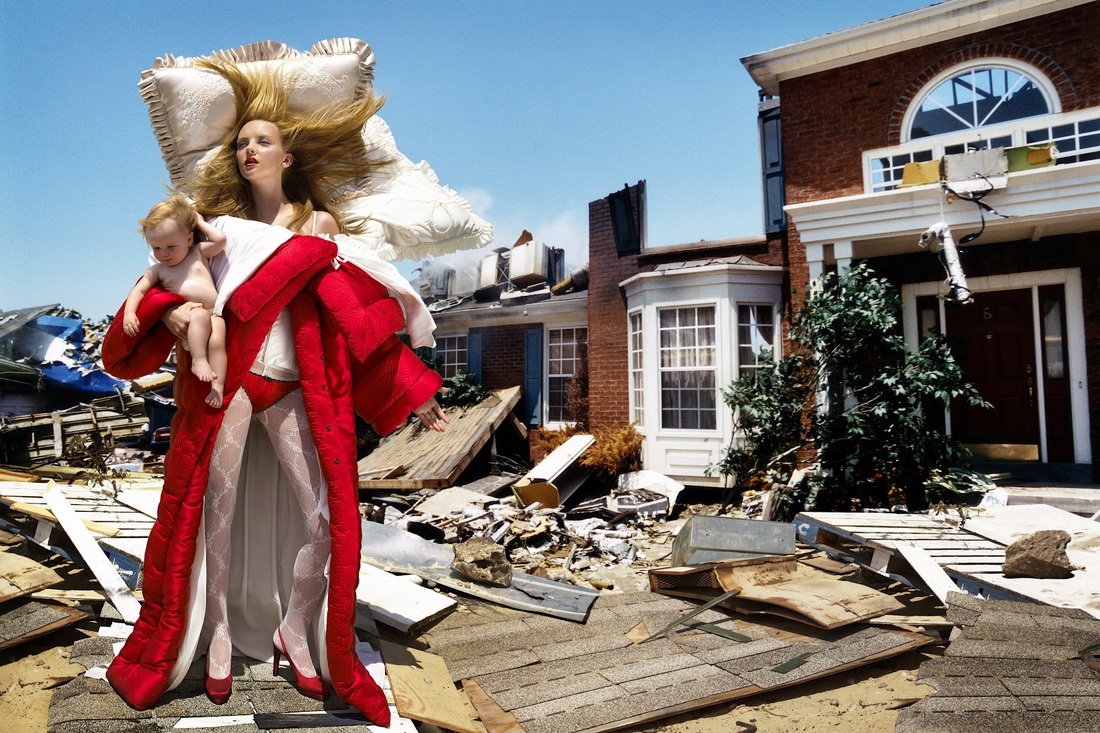
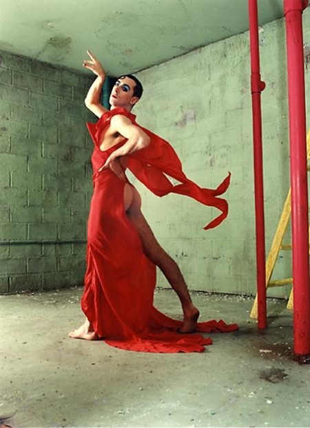
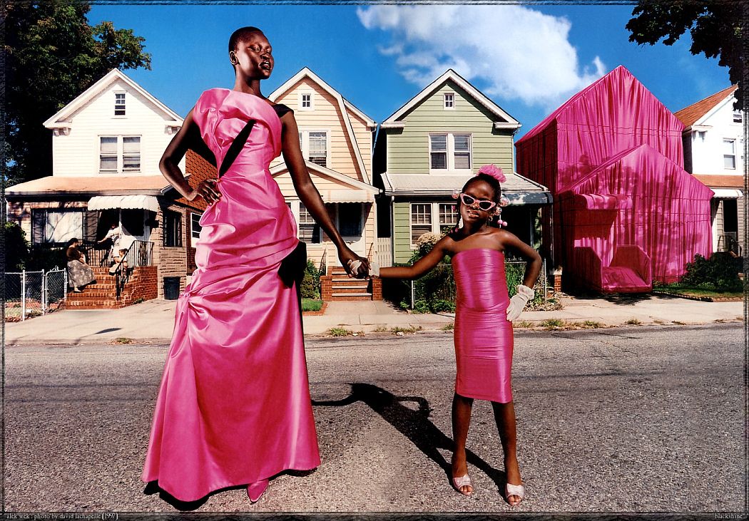
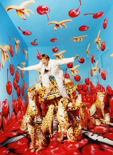
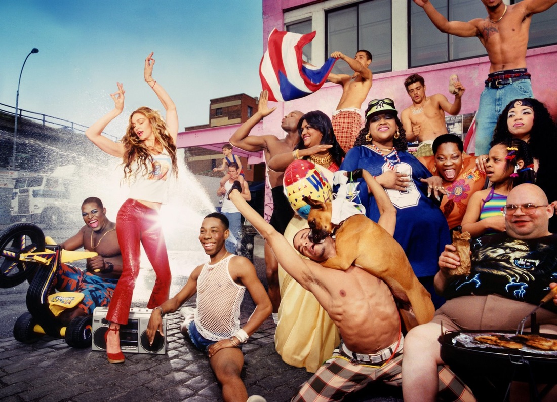
William Eggleston - in terms of the advent of color film
David LaChapelle - in terms of using color as your signature
Color Theory
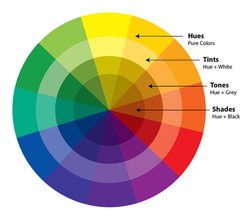
Hue: natural color before anything is added. Any primary, secondary or tertiary colors
Tints: are created when you add white to any hue on the color wheel. This will lighten and desaturate the hue, making it less intense.
Tones: are created when you add both black and white to a hue. You could also saygrey has been added. Depending on the proportions of black, white and the original hue used, tones can be darker or lighter than the original hue, and will also appear less saturated or intense than the original hue. Tones can reveal subtle and complex qualities in a hue or combination of hues, and are more true to the way we see colors in the real world.
Shades: are created when only black is added to a hue. This results in a rich, often more intense and darker color.
Saturation: Also called chroma, the degree of colorfulness
Harmony: Color harmony is the theory of combining colors in a fashion that is harmonious to the eye. In other words, what colors work well together. It is the reason the Hulk wears purple pant
Color Schemes: colors that work well together
Complementary Colors: Complementary colors are any two colors which are directly opposite each other, such as red and green and red-purple and yellow-green
Analogous Colors: Analogous colors are any three colors which are side by side on a 12 part color wheel, such as yellow-green, yellow, and yellow-orange. Usually one of the three colors predominates.eel
Monochromatic: tints, tones, and shades of a single hue. Monochrome describes photographs in one color value,
Grayscale: black and white photography
Color Stories
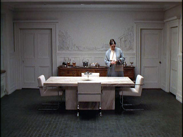
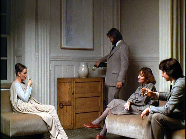
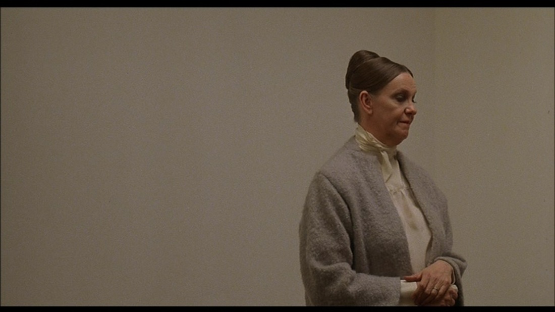
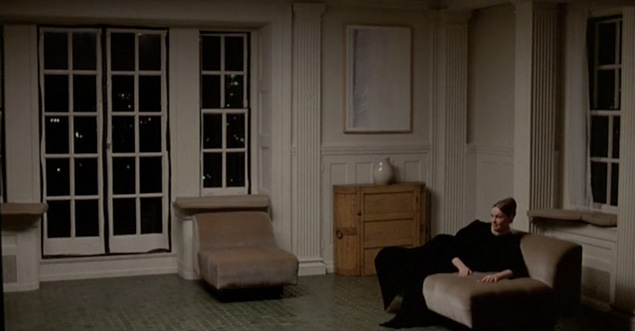
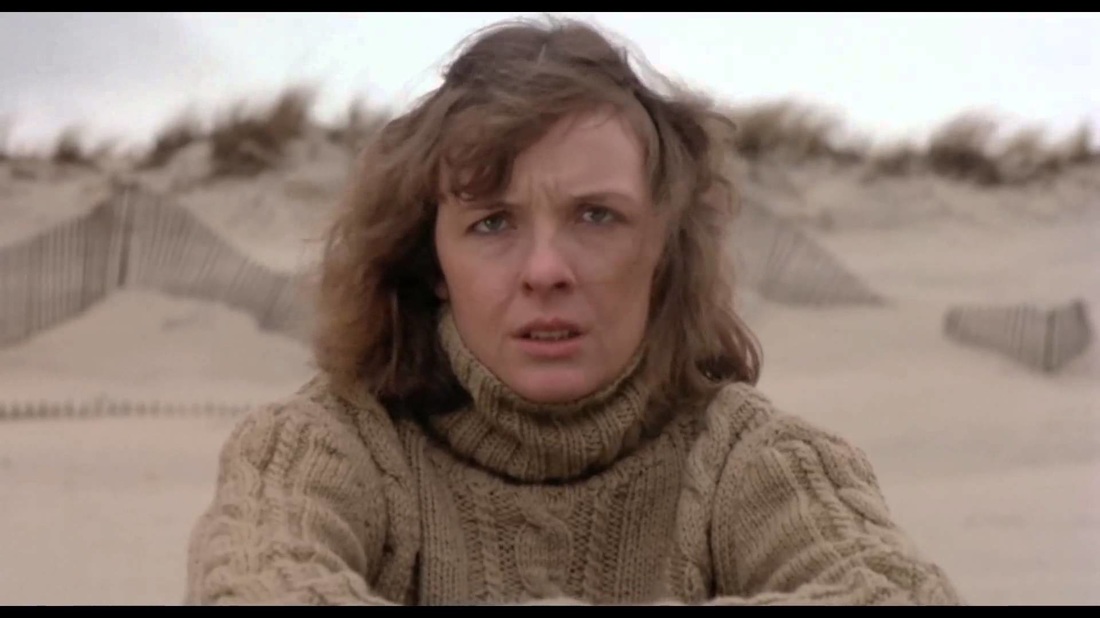
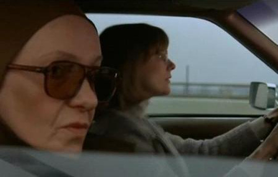
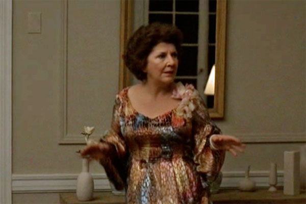
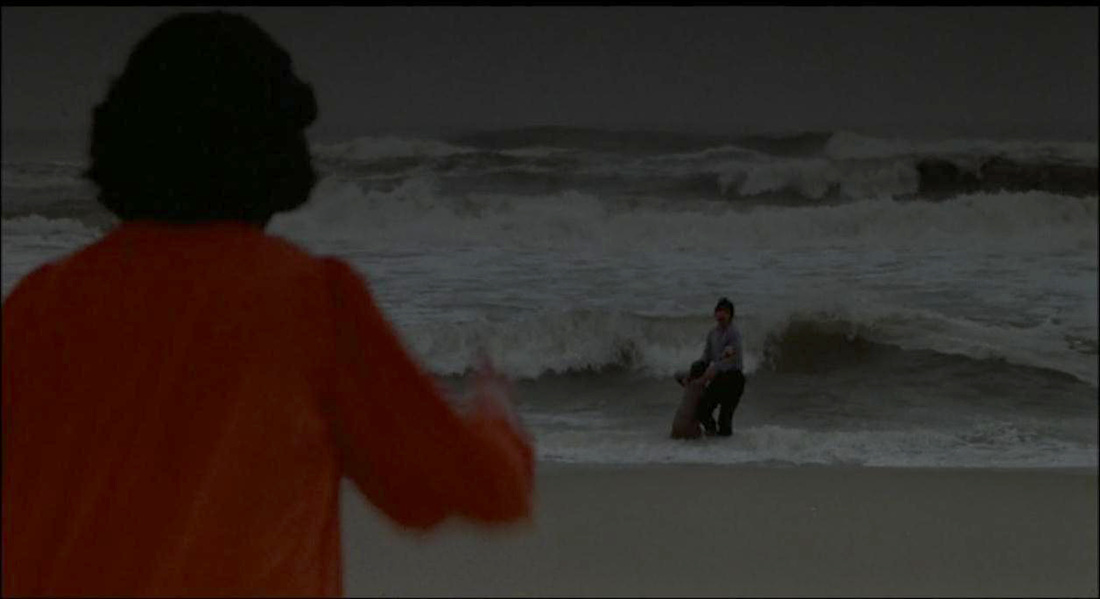
Interiors - Woody Allen
The Best Example I Could Think Of For A Really Effective Color Story Is The Film Interiors By Woody Allen
The title for the film interiors is a double entendre: It's about a woman who is passionate about interior spaces, she is an interior designer but who is also extremely troubled, all of the characters in this film are incredibly introspective and living a very rich interior life. The color story for this film is very intentional and consistent throughout. The palate is that of the beach. A primary color is introduced to the film when an extroverted person is.
The title for the film interiors is a double entendre: It's about a woman who is passionate about interior spaces, she is an interior designer but who is also extremely troubled, all of the characters in this film are incredibly introspective and living a very rich interior life. The color story for this film is very intentional and consistent throughout. The palate is that of the beach. A primary color is introduced to the film when an extroverted person is.

|
|

Black and White
Color being the most used contemporary medium in Photography Black and White can be perceived as a part of history and reminiscent of vintage photographs. Black and White can certainly be used to evoke a feeling of history or the past. It gives a sense of timelessness.
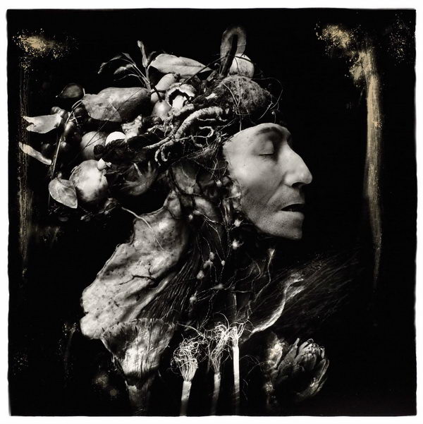
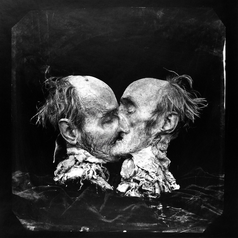
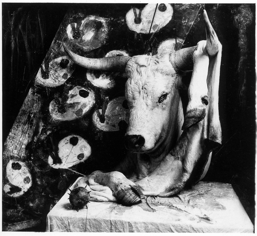
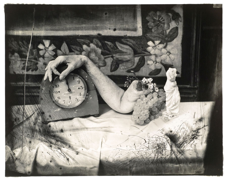
Joel Peter Witkin - not only shoots in black and white but uses a camera that is from a previous century, a twin reflex camera with film. He uses no computers to enhance his images but scrapes the negatives.
Street - Anne Marie D'Arcy